Thursday 9 May 2013

Movie


Trailer picture


This is the link to the image which most of the trailer have at start.  


In the movie the logo has been put a lens effect from the top right letter ‘M’ which runs down, goes around the ‘D’ of production and straight finished to the dot of ‘I’.  This idea came from one of the singles came out recently by an artist called ‘Nafees’ and his song called ‘Bukhar’ which came very famous. The lens effect I saw there which I liked a lot so though why not use in my movie.
- Audio:
There are few audios which I have used to make the movie.
Firstly the song called ‘Allah duhai hai’ from an Indian Movie cinema, Bollywood which named as ‘Race 2’. The name of the movie was also influenced from this movie. I used the song after the MK production passes and goes through the middle and then at the end where it says ‘aint one gonna race like me’.  This is the link to the video song; http://www.youtube.com/watch?v=LR2H1I6yabg
Secondly with the MK production there was a mystery tone been added to go with the lens effect. It was also got from YouTube and this is the link http://www.youtube.com/watch?v=fbDFAaPfl28  and there was only a bit of the sound was taken from the movie and that was from 1:39 till 1:45.
Thirdly, when the movie appears on the speed dial of a sports car was also taken from YouTube; http://www.youtube.com/watch?v=xxYj2T6OKq0  . The video was edited just the speed dial bit to go with the race 2 song and alongside with it the edited video was forwarded twice the speed of the actual video as I only needed that part but in quick section.
Fourthly, there was the acceleration sound which also came from YouTube; http://www.youtube.com/watch?v=PWFzmH4vwGo  . This however was needed to be put alongside the speed dial as the sound didn’t match once the video was fast forwarded to the original speed of the video.   
Titles:
Across the movie there are few titles runs to give audience a hint of what the movie is about, they were planned by men on my phone and these are the evidence;
Journey begins
 
to become the best

 
local league
 
the mainstream race


These titles were edited onto Primer which had fast blur effects with all of them. The colour of them was white with a pinkish glow as this goes with the DVD case background. There was also another title which got added into the movie and that was ‘coming soon’ and this had the same effect as the other titles.

- Hampton way:

This is a video which my friend helped me to record while I was driving on the dual carriage way. The reason for the video to be there are that one is my creation and the other is that because there was a need of local league video shoot and for this reason the video been added to the movie. 

- Mainstream race:

This video comes in about the ¾ of the time and is also taken from YouTube; http://www.youtube.com/watch?v=uDP7Pty8Qnw . The edition to the video was just the one I wanted when I first saw it and that was the car in a drag race as this went with my mainstream race.   

-  Race font from DVD cover

The font was saved as a png file so the need was just to import it into my movie and then add the coming soon underneath it.   


DVD Lable

 
The DVD label did not need extra work to be added to it as they are most the copy of the actual DVD case. Therefore these are the things which were copied to the actual DVD label;
1.        Race text with the sub line, ‘started by many and ends by one’.
2.        All the logos i.e. universal, age restriction, fact and Dolby digital.
3.        The Desert with the car
4.        City image background
5.        There was a restriction writing been copied from one of the original movie DVD label and you can see in the image below.


Wednesday 8 May 2013

DVD Cover


Starts – 12th May

Finished – 8th May

The reason I did not mentioned these in log book as the information are all blogger and would be copied here. However this was like a paper assignment to be hand in so therefore to be organised, it would be better as each specific task has been created to make it easier to read.

Borderline:

The whole DVD case needed to be professional so therefore Jamie took us to designed and the page layout as a class.  

Background: for the DVD page there was needed of large resolution pictures as the setting of the page was really big there for in the search engine of Google there was a picture of a city I found which I liked it lot to go with my DVD case. Once the picture got imported into the Photoshop, edition of the picture was started.
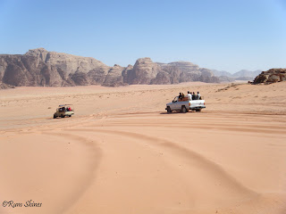
Firstly the picture of the case was too big and the part which I wanted was mostly on the right hand side of the picture as you can see in the image below. Then it got cropped in Photoshop to get the exact size and therefore been imported into the main DVD cover. However the left side was still missing so I thought it would be better to have a mirrored image on the left side to the right side so the picture got pasted twice.

 
http://images.cdn.fotopedia.com/flickr-676142105-hd.jpg
Secondly, the picture was been played around the hue and saturation tool in Photoshop to get nice bright colour in its background. Alongside there was a lens affect been added into the background at the top as this was to go with the name of the movie, ‘Race’.
   Thirdly, I had the actor photo on the background image as a new layer but however once the text was been put the image look really bad so therefore the actor image was deleted.
Fourthly, the lake needed to be deleted from the actual image but however this would make the image as a whole look worse. Therefore a thought came in my mind that why not add a desert onto them which will look much better and at the end it did turn out to be much better compare to the lake image. The image below is the picture of the desert which I took from Google search engine and only two edition to it and they were the size been kept to match the DVD cover and the sky at the top of the desert been removed. 

 
 Car:
The desert had a road in which made me put forward the idea to put a car in the road. The car which looked better was a white colour Bugatti as the car is very much famous and expensive and also the white colour looked really nice to go with the colour of the image as it its dark and white will stands out. However the car itself went through few editions.
Firstly the image background was deleted. This is because an image without the background removed would looked un professional so therefore in Photoshop it got edited.
Secondly, the car has to be eye catching on the road of that desert as its dark and the colour of the car is not enough. This is where the lens effect comes in which were put onto the car headlights looking like its coming to you.
This image below is the evidence of the car been edited into the Photoshop.
 
 
Font of race:

 
This is the name and logo which I came out with it at the end.
It got started from a normal text with the size over 100 pt. As the text was to show the movie name race so the design of the name go edited into the race style as the name is running into the race. The effect which was able to do this was the tiles effect with it the three dots were also turned out to be excellent.   
The movie name looked simple so a sub line was thought to be put as little guide about the movie. Therefore I came up with a line and that was ‘started by many ends by one’.
 Flags:
On the DVD case there was a car, road and a name race so the only one thing was missing in the race is a racing flag. Therefore using the Google search engine got the racing flag. To make the flag to be able to be on the poster there was some edition needs such as the background needed to be deleted. Once the background got deleted all the white parts of the flag got deleted. Therefore using the paint tool and quick selection I manage to fill the empty spaces with the white colour.
Story line:
For the story of the movie was came by me from all the movies I have been watching about racing. This made me came with a story of a poor guy whose heart is in racing cars and winning the mainstream race which is the worldwide racers will be racing each other and winning the competition. The image below is the story line to the DVD case.
The guy on the left is the hero in my movie and in real life he is a Bollywood actor named Saif Ali Khan and the image on the bottom right is from the video which I used to put in my movie. 
 
 
Movie information:
The movie information was taken from reaching many other DVD case as my work place is at supermarket where all the DVD gets sold, therefore I had browsing them for half an hour and came with the information at the end which is shown in the image below.  The most important information I thought that would be put on the DVD case was the running time, subtitle of the movie and its language. 
Logos:
The logos which were used into the movie poster were taken from the Google search engine and there were only 4 of them which I thought would be very useful alongside there was my half hour research on the DVD case;  
-          Universal
The logo was imported from internet into Photoshop and once a picture is in clipboard and when you get an new page in Photoshop, it automatically reads the size of the image you copied.


The background was deleted as I wanted the logo to be white with the background delete.
 
Once the background was deleted there was a need of colour change so colour overlay was a good option and then a shadow just to give a professional look.
-          15 age restriction
The age restriction was just copied from internet as this is to with the originality in the restriction. This is the link of the logo; http://www.rswebsites.co.uk/mediafilm/production-toolkit/bbfc-15/ .  
-          Fact / Dolby digital
Fact and Dolby digital was performed in the same manner as universal logo. Firstly the back ground was deleted and then the colour overlay came in to give it a white look to go with the desert image in the background of the DVD case. 
-          Barcode:
This is one of my creations towards the assignment and it was created in Photoshop.
Step one was to get a white background page and then add some black colour stripes. This image image was taken at the creation of the barcode.


 The other thing was to add another more stripes but have to keep some thick and others really thin. Once the stripes done then the numbers will be added to the stripes and they were random numbers which came into my head and I just added them. The image below is the finished barcode which I came out on Photoshop and was ready to go onto my DVD case.  

Thursday 7 March 2013

DVD cover research


Research for DVD cover:

The task was to create a DVD and a CD cover for our own movie in this assignment. Therefore before I start, planning and researching was necessary to be able to create a professional DVD Cover. With the help of Google search engine I researched few other movies DVD cover to help me in my own work. This is because I am myself not a specialised designer for movies who design posters for movie. Therefore researching was a good suggestion to get the ideas of how a DVD and CD cover is made.

Firstly DVD cover will be annotated of what kind of things they have put across on a professional cover.  The picture below was searched on Google images which was and this is the link to the actual image; 


On the other hand, with the case the CD is left to be researched. Therefore, again google search engine has been used and found one good example to examine for my work. The image underneath is the research material and this is its url,


Tuesday 5 March 2013

Movie 1 eample


Movie 1 example


This is a first time we all students go to get our hands on Premier software. Jamie our teacher provided us with two videos which were saved onto the VLE and we just had to download them into our area.

Moreover two videos were from the organisational TV ad called compare the market which contained many other TV ads so we only chose Alexander Sergei and Yaakov ones to use.

The edition contained as Jamie lead us were to take a part out from both videos and add them together and at the end of the movie the organisation name i.e. ‘compare the market’ has to been seen. The edition of the video clips were performed using the ‘mark in’ and the ‘mark out’ tool and then we had to drag it across to the where it should be. Mark in tool was to declare the starting point of the video to be cut from and mark out was the point where it should be cut to. Once the videos been edited they were dragged to the timeline of the movie and joined one after another.

Furthermore, I did mentioned about the company logo; ‘compare the market’ has to be put right at the end of the video. The photo was already been taken from Google search engine which was been imported later on to premier and once again was just needed to be dragged to the timeline and this time it was right at the end of the video. Once the edition was completed the video was rendered and saved it to my area in the University as it was a risk to put on the personal storage device as the computer functioned really slowly.      


Monkey soft logo


The task was to design a logo for a company called monkey soft. This was given to the whole class to come out with an individual work as it was a platform for us students to learn more about the software, illustrator.
The things were started off by getting a landscape A4 page size setup on illustrator so I have a plenty of room to design my logo. As tool pen was used earlier week to design apple logo therefore I used the same method to design a monkey face as to go with the name, ‘monkey soft’. Alongside with the soft name with the monkey the outline of the monkey face has been in soft touch. There was a monkey so therefore I though that I might need to put a banana with it using the same method which was used to do the monkey face design.  The below picture as you can see which shows the evidence of what i have designed so far.   


Moreover the picture still looked empty as the main part i.e. the name of the company was not on the logo. Therefore the text font which suited the logo was ‘Kristen ITC regular’ with 41 pt and because the soft part looked better with small size so it was minimized it to 27 pt. However the logo still looked very simple as there was nothing around it. Therefore a ring sticker been added around the monkey with another additional sticker to it which lies between the font ‘monkey soft’. The colour part was the most important part to it as the logo has to look professional so for this reason brown colour which soft strokes been added to most of the work whereas the sticker between the logo kept yellow to stand out and banana in its original format. The image below is the finished product which i have designed for first time as a task with perfection and was really proud with it.       
my logo :) 


Tuesday 26 February 2013

Apple Logo Practice


This image was edited in Illustrator 

Before


After


What?
We learned about pen tool in Illustrator.  


Where?
It was in the class with everyone but the edition at the end was performed individually so the after image was design and the edition was chose by me.
Who and When?
Apple logo image was edited after Jamie demonstrated about pen tool and also about illustrator as everyone were new to the software.
Why?
To learn how to create vector graphic images which is very useful tool in our work, firstly because in the DVD cover and CD cover there is a need to have a vector image. Secondly the covers have a very large resolution therefore the images will be stretched meaning the pixels will be isolated if it is a bitmap. For this reason vector graphics image is used.


How?
After importing the image into illustrator we locked the layer of the actual image so it does not get effect by the editions. Secondly, a new layer was added which we used to get the shape of the apple logo using the pen tool. It took very long time as the logo was curvy which the pen tool has to be adjusted by yourself. However once the shape is made using the pen tool then the inside of it can be transformed in any colour you want. Thirdly, a graphic design was chosen in the graphic styles on the left hand side of illustrator. The design I choose was flower and leaf patters which were laid all over the apple logo and the appearance I kept it as blue. This is because leafs represent vegetable and apple is also a vegetable there for I kept them linked. The appearance which is in colour blue which also represent the logo of Apple as most of them are in sky blue colour.


Finally, the last touch was performed on the transparency which is underneath the graphic style on the left hand side. The transparency which I choose was ‘screen’ as this kept the nice shadow coming from the top right hand side of the original apple logo.
The result you can see in the after image.


Tuesday 19 February 2013

Healing brush tool


There were three different images which were used to get know the Photoshop software. The below three sections have put through to describe how the images were edited from the original photo. The three pictures were desert, Ian Mckellen and a teenage girl face.    
1. Desert
Before  

After


What?
We learned patch tool which deletes the objects in one image such as mobile, cars and people.   

 Where?
It was in the class with everyone.  

Who and When?
This picture was edited when Jamie was demonstrating about Photoshop’s patch tool . 

Why?
To learn how to delete an object within the image this can be anything such as car for this practice. Moreover this practice was important as for our DVD cover and the CD cover. This is because covers will be involving pictures from internet which we might need some parts of it and patch tool is the best tool for this as it can remove the exact object we want.     
How?
Firstly we got the picture from VLE and as a practice we wanted to delete the car on the left. Secondly, we used the patch tool which can be accessed by just clicking (J) and it is located at the 7th icon down in the left banner on the screen. As the left car needed to be deleted we went around it including its shadow. This however gave us an object which can be drag and be replaced with the other part of the whole image. For example the car was an object in the desert image and the area around it had desert which looked very similar so the car object was just moved towards the left so the tool can replicate the area on the car. The result shows in the ‘after’ image at the top that the car from the original image has been taken out but still the image looks untouched.


2.       Ian Mckellen 
                                                                                Before


 After  


What?

We learned about healing tool which is located in the pact tool (J)


Where?
In class with everyone after the desert picture.

Who and When?
This picture was edited when Jamie was demonstrating about Photoshop’s patch tool in which we had to use healing feature for Ian image.

Why?
To learn how to delete all the marks on the face of a person i.e. making an old person look a bit younger by fixing all the wrinkles on their face. This again is a very useful tool to my project as if there are any pictures which involves any face edition for my actors as healing tool does not only make someone look younger but also edits any kind of spots or marks which appear on the face. This however makes the face more like a model and for this reason it is called healing tool.

How
The first process i.e. the location of the image was same as the desert picture which is VLE. Once the picture was saved to our area or any of the devices we imported to Photoshop which meant we didn’t had to fiddle about with the settings of the page i.e. width and the height. Thirdly, using the path tool (J) for keyboard shortcut in which it had another feature which was called healing tool. This however helped me to edit all the marks and wrinkle on the face of Ian. The process was by clicking alt on keyboard which gives a selection tool to select the area which you want to copy and paste it after. After this you go over the marks with the mouse which generates the area which you selected previously using the alt key. It took long time for me to do as there were many marks but at the end the result was good and you can see it in the after picture.
3. Teenage girl
Before


After 
What?
We learned about spot healing brush tool which is located in the pact tool (J).
 Where?
In class with everyone after the Ian picture.  
Who and When?
This picture was edited when Jamie was demonstrating about Photoshop’s patch tool in which we had to use spot healing feature for young girl.  
Why?
To learn how to delete all the marks on the face of a person i.e. making an old person look a bit younger by fixing all the wrinkles on their face. This again is a very useful tool to my project as if there are any pictures which involves any face edition for my actors as healing tool does not only make someone look younger but also edits any kind of spots or marks which appear on the face. This however makes the face more like a model and for this reason it is called healing tool.
To learn how to delete the spots on the face of the person i.e. making the face look like a model. Alongside the healing tool this spot healing tool is also useful as it is specially designed to fix all the spots which a person has on their face. This is indeed very useful as for media purpose, there is a need of attraction at eye catching as many people will be looking at the images over internet, newspapers etc. therefore the masses would not like if the image contains any marks or wrinkles as this would be classed as unprofessional.
How?
The first process started by importing the image from the folder which I saved the others i.e. desert and Ian image. As soon as we opened the image we used the spot healing feature in patch tool. Secondly, we were trying to delete all the marks and spots which were easily to be seen as this would make my work easier as the bigger work been done on the image and what I will be left with are those which are very hard to see. Therefore to get all the small marks off from the face of this young teenage girl we had to zoom in from the original image and using the spot healing brush we had to right click from the mouse on the spot or the marks after choosing spot healing brush. This however made all the spots and marks disable. There were loads of marks and few spots on the face of the young girl however the spot healing tool made it very easier and after all the hard work the result came that most of the face looked like a model face. The result you will be able to see in the before and after image.